Creative 101 - Not Everything Cool Comes to Fruition
After a great SEMA show in 2014, Castrol came back to us with a new product, which in turn needed new "Holo-box" content. The show would feature an Oculus set up and would need an animation to attract show goers to the new interactive display. The basis of the show focused on drifting, and the process of creating the perfect drift. I had come up with a concept for a 30 second loop, that would take the viewer on a high energy journey of the process of the drift, while also plugging the Oculus technology at the show. Unfortunately, due to budgetary constraints, the Edge Drift "Holo-box" project never got finalized. Here are the storyboards I came up with for the animation (click the image to cycle through frames)
After some client feedback with a few adjustments, here is a sample animation based on the storyboards:
Castrol at SEMA Las Vegas - Revitalizing a Brand's Digital Presence
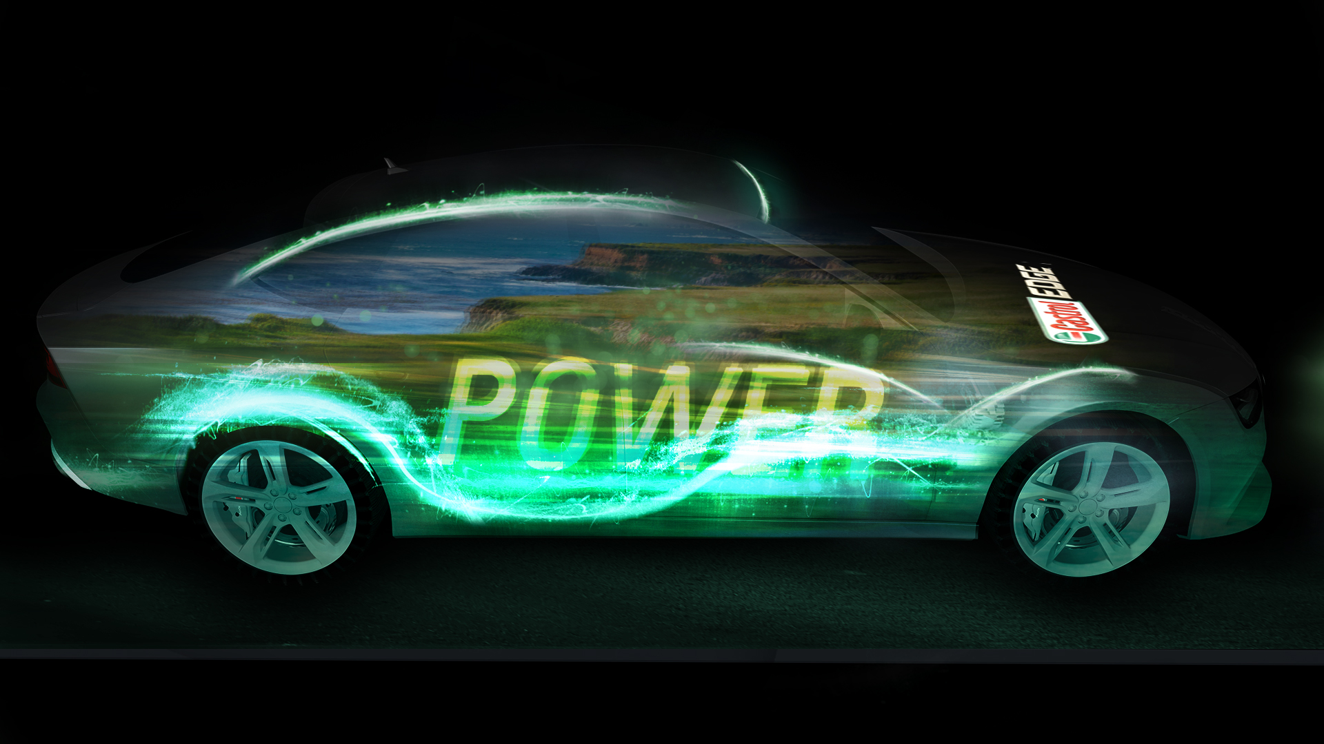
Castrol was looking for a way to spice up there presence at one of the largest automotive trade shows in the world. It had been several years since they had a booth in the show and were looking for new forms of engagement with their consumers. Using projection mapping technology, we created a fully animated visual spectacle that would highlight the primary products of Castrol's new motor oil products, which consisted of Magnatec, Edge and High Mileage. The full animation would be wrapped to a 2015 Audi R8. With this as the centerpiece, we would also create looping "Holo-box" animations for each product which would surround the exhibit and help attract people into the booth. Incorporating sound design, 2D and 3D motion graphics, we wanted to create an experience show goers wouldn't forget. Here is an edit I created summing up the show:
I began work on the project by storyboarding the Holobox Loops in Photoshop, as well as the different animated sequences that would appear on the car. Here are just a few frames from that sequence:
After several weeks of testing, building out the animations, and creating a tight edit of all the content that would be projected onto the car, we had come up with a really nice show. It cleverly combined branding with an abstract journey of a high performance sports car, braving the elements and benefiting from the science of the Castrol synthetic formulas. Here is a rough work in progress of the build, shot on an iPhone:
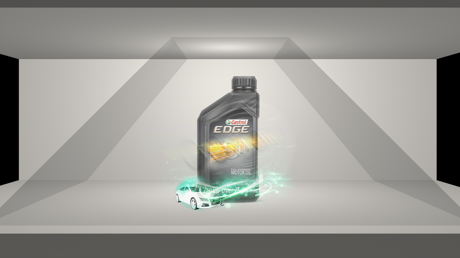
For the "Holo-box" loops, we wanted to create animated short stories, that in a short amount of time, would take the viewer through a playful overview of each product: Magnatec, Edge and High Mileage.
Magnatec Storyboard Frames:
Edge Storyboard Frames:
High Mileage Storyboard Frames:
The next step was to produce the actual animations for inside the holobox displays. In designing for the holoboxes, we needed to consider the physical space where the animation would live and the left, center and right perspectives that the show goers would be viewing the animations at. Side profiles were rendered in 3D of the bottle and then 2D graphics utilizing Video Co-Pilot's Element plugin took care of the 3D text. My job was to composite the 3D layers into After Effects along with custom-built effects to compliment the cylindrical shape of the bottle. The end result were three short-form, attractive animations that teased the potential of the product and captivated viewers. Here is a video showing the final Magnatec holobox animation:
AXA Equitable Timeline Experience - Bringing History and Energy to the Workspace
When AXA Insurance came looking for a new and exciting way to bring their history and brand to life, we answered their call. Their company had a colorful history of interesting information that ideas that they wanted to display to the world. Our company pitched the idea of a multi-screen animated display that would exist on a wall in their lobby area. It would be something that company employees and clients visiting their office could interact with. The display would consist of a historical timeline as well as themed videos that would speak to each of AXA's key principles.
The first step of the process was to find a way to seamlessly integrate the historical timeline with the themed videos, and find a way the user would be able to go in and out of both experiences. This would require a hardware configuration as well as flowcharts to outline the path of interaction with the display. Here is the final wireframe I created for the AXA Timeline Experience:
The next step was to come up with a look for the historical timeline. The idea had been to start the timeline using their AXA blue color and use a blue and white look. Gradually, as we moved into the 60s and 70s, the timeline would shift to more colorful designs, hinting at the evolution of technology. Each year would expand and open from the AXA "switch," a slanted line that was a fundamental design element of their brand. After allowing the viewer to read the captions within a certain year, the switch would collapse itself and shift to the next important moment in their history. Here are a series of layouts I designed for each year:
After a few weeks of animating and motion tests, we had created a very solid framework to build out the 15 minute full timeline animation. Here is a clip during one of my nights of animation tests, showing the four screen animation going into a specific year, holding for the viewer, and then animating out:
Overall, the project ended up being very successful. The client was very pleased with the work, and all of the hours or animating and testing definitely paid off in the end. This was one of my favorite projects as I was able to see the process through from conceptualization to the final execution. Here is the final loop of content for the historical timeline in 1080p form, as well as a 1080p version of one of the AXA Themes, Corporate Responsibilty:
Pasquale Chieffalo, 2008 - 2025


